Saturday 14 December 2013

Fonts research- Producing our ideal font

 In order to make this font we looked through a variety of ready made titles so we could get an idea of what we wanted and then designed and made it on paint and photo shop. This made sure that we got the right look that we wanted at that time however it was not exactly what we wanted. We used this font, which we found during our research as it was the closest to the font we wanted to achieve.
In order to make it we used paint to begin with so we could use shapes and paint to make the design we wanted and then used photo shop to crop and make sure it was up to scratch. We reflected this idea off of our initial idea as we knew we then wanted to make it a lot more bold to ensure it stands out well. We also decided we wanted to have the background of the text to be black and the writing to be white as we thought it pursued more of a creepy effect. Also would look better when we put it in our film as we are making it seem tense when the titles bang in making it give a fright to the audience. We did this by converting the colours on a website which made the white background black and the black font white. Although we liked the way the writing is set our we still didn't think it was perfect. We then used a tool on paint to do the scratching effect to give us the worn, bark-like effect. The next stage involved us pasting this onto photoshop where we smudged the scratch parts so that it would blend a little in the white font so it would look professional. This took us a while as it was very hard to make it look effective without it looking like they are plain straight lines cutting up the letters.
This is our final idea. We related both our initial idea and our second idea ( in 'Font research-The Woods' Blog) to make this final one that we all liked. We have used the layout of the second idea and as we liked how on the initial idea, there were scratches going across some of the letters. We wanted to add that into it and make it more obvious and exaggerated. This meant it looks even more scary and link into the name of our film "The Woods" as it can come across like the scratches are branches or bits of mud covering parts of the letters. straight lines cutting up the letters. This font would be our final opening titles of our opening two minutes of 'The Woods'.


Font research- The Woods


This is a very important piece of research to do as this is the font which expresses our film of ' The Woods'. This font has to be perfect to express the genre of the film and to suit what occurs within it.


This was our initial idea for our opening two minutes of 'The Woods'. We liked how it was clear and the use of a worn effect on the font, suggest oldness which gives a creepy side to the font. The use of having the 'T' being bigger than the others makes the font stand out more, which would attract the audience as this would e the focus pull of the title as our eyes go straight to this point. . It also look quite formal which made us decide that we wanted our final idea to look formal and not tacky to make sure it attracts the right audience and suits the genre (horror) and doesn't create a wrong message towards the audience. However through our font research I found that these days horrors opening titles consist of a black background and white font, as the black implies evil and darkness and the white could suggest purity trying to shine through. This means that this font would be less effective as it doesn't appear scary due to the background being white rather than being black.

This was our second font we researched. The use of the black background makes the white font contrast from the background ensuring it is eye-catching and bold as it can be. This also follows the conventions of a horror film as these opening titles are usually black background and white font on top. This font is also very bold and broad which shows the impact of what 'The Woods' can do and emphasises the danger of what they can do too. However the font may be a bit too thick to be a horror, as it could be confused with being a action film due to the boldness. However, this could be used as a template in creating out horror opening titles as we can thin the lettering out and add the worn effect of which is used on the previous font.
This is the three font we found, which has many effects. This fonts suggests that the someone has written on the screen in blood due to the dripping effect and the smurring effect. However from my 'Font research' Blog from analysing fonts from published horrors, I found that in the past; horror films would have this style this would suggest blood dripping. However in now-a-days this is seen as tacky and exaggerated, which is not what we want our film to be like. This means this font may not be used due to previous research.  
Overall, I believe we should use the middle on as a template to producing our perfect font for our opening two minutes as this is the closest font, which would suit our film 'The Woods'.

Location research- Final decisions

Birds eye view of the location we have chosen for part of the film.


We are planning on opening the two minutes in some woods, more specifically Bookham woods. We will only film here for a section of our two minutes as we thought it was a good setting to include the opening credits while building tension because of the spooky atmosphere surrounding the character. The atmosphere of the woods   naturally takes you out of your comfort zone when on your own, making the audience feel on edge and as though something will happen to this character. we will include shot that make it look like someone is watching that person which makes the audience feel even more out of there comfort zone. 


We chose to record part of our two minutes in the woods in Bookham because; it is closer to the next location we are going to film our movie, it also has a very eerie feel to it which sets the scene of the chilling story line. Filming in this area may be quite hard if we get the timing of when to film wrong because of the amount of light, as it's winter time, it gets darker quicker, this might not be a bad thing as the darkness and dull complexion of the sky will set the scene of our horror movie however it means we will need to film at the right time to make sure it has a good effect and is done right. If we used Epsom common or Fethcam Mill pond, we would need to apply addition light as there is either limited light or too much light. 


Our second location we are planning to include in our opening two minutes is a regular home for regular middle class/working class people; using this home is a convention of most horror movies because it helps the audience feel more engaged in the film as they will be able to relate it to their everyday life, which will increase and leave fear even when the film is over because they would go home to the same lifestyle that was presented in the movie, we have included this by using mundane realism.

The house we have chosen to use for our opening two minutes is suitable as a location because of the way the interior is set out e.g. the stairs go directly to the bathroom which we are going to show in our movie to build tension, the front door is almost opposite the stairs which will allow tension to be built because it means that as soon as she enters the house the audience can see the place where the antagonist will be; making it seem even more chilling.

Location research- The house

Kathryn's house- Bookham 
This is our first location of where we can have the second part of our film. We could use this house as it would be ideal due to one of the woodlands locations also located within Bookham, which would mean that the scenes would be more fluent as they are fairly close together. The windows of the house could provide us with a effective camera shot as we can use the camera to act like the antagonist or someone in the house, looking at the protagonist as she slowly walks down the drive. As the house is detached, it makes our film more realistic as the protagonist lives on her own and having a house standing on its own, shows that nobody would hear her if she screams...
Charlotte's house- Fetcham
This is our second location we researched. This house is located in Fetcham, which is very close to the Mill Pond location, analysed in the blog 'Location Research- The Woodlands'. This would make our filming more fluent as we can show the journey of what the protagonist had to take from one place to the other. The house is semi detached, which means realistically if someone screamed or broke into the house, people would see it, which makes the previous house more effective. This house is also a little smaller than the other house which means the antagonist can gain more entrance in that location than this. The short drive means that the shot which I described previously would not be as effective.  

Location research- Woodland area

 Location one- Fetcham,Mill pond 
 This location could be where we begin our opening scene as the location can create an eerie effect due to the dim lighting of the lampposts. The light generated by the lamppost would  ensure the shot is gloomy and adds tension as it would not be as visible as daylight time, which means that we using the environment to create motif as we are reflecting the feelings of the antagonist and protagonist by using the atmosphere around them. However added lighting may be needed due to the limitation of light the lampposts give off, which means the camera would struggle to capture the scene due to the lack of light. Although there is a negative there is also a positive, as the general location is a very common place which would make our scene more realistic, so therefore the audience would sense an aspect of fear as they imagine themselves in the same position as the protagonist.This is many people's fears of walking down a dim lit, narrow pathway, thinking every noise is a warning that someone is behind you . On the other hand, this location may cause a slight difficulty as there is no areas for the antagonist to hide behind, which is how we are going to begin building up the tension for our opening two minutes, as this would show how close the antagonist is to our innocent protagonist, how scary! Having minor places for the antagonist to remain hidden and unknown would mean a decrease in tension which is vital for our final scene to have the biggest impact as possible, so if we do not have this it would mean we could not show us much tension as we would like too.
Location two- Epsom common
Our second location we researched was Epsom common. As you can see from the video and picture, Epsom common has lots of overhanging trees which would be fairly effective as when the darkness falls and the shadows of the branches casts, it would seem as if they are acting like hands which are trying to grab the protagonist. This would mena that we would to get the timings of our filming accurate so we can have enough natural lighting, to make it as realistic as possible, and to achieve this effect. Having lots of overhanging trees would also mean we can use our idea of having the antagonist hiding behind trees, which we would create this by making the camera act like it is the antagonist
stalking and staring at the protagonist behind trees, for example. This would make our production very dynamic as we are using various creative shots, which would provide us with a fluent production. However there is a downfall of having lots of trees, as it would result in a limitation of light, meaning we would have to produce natural- styled light so the camera can detect the scene. Epsom also has lots of paths, which could add tension as the antagonist could come from any direction. Also the ground is uneven which could lead to our protagonist on falling over as she keeps hearing noises.
Location three- Bookham common 
This is our final location we found, which is known as Bookham Common. This has quite a numerous amount of trees which would make the protagonist feel as if they are close in on her, which would increase the tension. However, although there are lots of overhanging trees, there is not enough to block out all the natural light, meaning there would be a substantial light, meaning we would not need to any addition light. There are different sizes of paths, which would give us a choice of which ones to uses and we would like the perfect location for our opening two minutes. As our protagonist may get fall and cut herself; the paths within this wood can be very curvy, which means she can cut her hands on a passing trees. This woods are also closes to houses more than the others, which is a benefit as the protagonist runs home to clean her cut. This may be more effective than the others as lighting is negotiable so it would not effect the scene, unless we choose the wrong timings of filming.

Script for 'The Woods'

The main protagonist character will be walking through the woods on her own, which would create a little enigma on where she has been. The establishing would be of the girl's back, which then she begins to walk away, blurring the shot as she does so. Although there will be no word spoken through most of it there will be sound effects like twigs breaking and bushes shaking on top of some tension building music. Suddenly she would hear a snap of a twig, which makes the protagonist say 'Hello?'. No responds. She begins to a walk fast, drastically darting her eyes from place to place; this will create tension in the audience and creates an enigma as they will want to know who is there. As she is not concentrating on where she is going she stumbles and cuts her hand, deeply. She grasps hand and gasps. There's a noise, not from a twig snapping, but a screech. She pulls herself up and begins running, as her bloody hand drips blood as a trail. 

When she arrives home she slowly walks to the door, as it is slightly open. She opens the door slowly and says 'Hello?' Again there is no response. She enters and take her shoes and coat off keeping eye contact with the top of the stairs as she just realises that the upstairs bathroom light is on. She slowly ascends the stairs and pushes open the door, but there is no one in the room. She closes the door behind her and begins washing the cut on her hand. 
Suddenly, there is a bang outside her bathroom door. She cautiously opens it only looking out with one eye. There was nothing there. She slams the door and locks it quickly, reassuring herself it was nothing. She turns back to the skin and washes her face, thinking she is just tired and needs more sleep. When she lifts her head up again, the antagonist is standing behind her. She screams as the title transition quickly on stage, with the girl's scream echoing in the background 

Wednesday 11 December 2013

Influences on production

This was a huge influence for our production of our film ideas as this gave us the initial intentions of having our antagonist present within our opening scene rather than having something paranormal. Scream involves the antagonist who is crazed about horror films, so they decided to make their own one, where they were the killer. This antagonist intrigued us to have a similar antagonist within our opening two minutes, however we need to ensure there is not to much in the opening scene. Using the phone to gain connection to the protagonist, their victim, would scare the audience as this can easily happen them; this is very effective, which is why instead of using a prop we thought we would use someone house to ensure the audience would relate to this happening to them. Also, having the antagonist unknown creates the whole enigma on who is this and why are they doing it? This is why we used a mask within our costume so the identity of the antagonist would be undetectable, which would leave the audience asking themselves one question 'Who is this?'
Friday the 13th was another influence to our production as, again, this film involves an antagonist which is the frightening element of this film. In contrast to 'Scream' film, this film is set in the woods mainly whereas 'Scream' is located usually in the victim's home and neighbourhood. These two influences inspired us to try and ensure that both of these locations are within our opening two minutes as having the woods would symbolise where root of the problems began, for example, the stalking, and involving the house location would make the audience relate to the scene as they could imagine this happening to them as many people have a fear of being home alone and thinking someone is in the house. The antagonist was also wearing a mask, which reinforced us on using a mask for our antagonist, as our we would not want to give too much away but we don't want to disengage with the audience as there is little fear to scare the audience.
 Paranormal Activity was our first influence to producing our opening two minutes as this is one of my best horror films as there was always something scary in nearly every scene. The use of paranormal ensured the audience was scared as, generally, people are scared of paranormal as no one, presently can prove that is does not exist, so they begin to believe that this could occur to them. However this was our first influence, we began to think how we could achieve professional looking paranormal effects, which seemed impossible without special equipment such as pulling ropes and fishing lines which are usually used within these kind of paranormal films. Although we could not add this to our opening two minutes, this film inspired us to produce a horror film for our opening two minutes.
Another influence was 'The Cabin in the Woods' as the genre is similar to ours, which is a horror. This film, was set in the woods, which again reinforced the idea of setting our establishing scene within a wood. Instead of having frightening events occurring in the wood, like 'The Cabin in the Woods', we would build tension, such as someone looking and stalking our protagonist through the wood.

Tuesday 10 December 2013

Mood Board

Picture 1 - The picture shows a screaming blonde girl, she is presented as quite innocent from the way she is wearing a white jumper and has blonde hair.  This stereotypically shows she is not very strong or intelligent, in the image it shows her screaming and crying which is making her look weak. This tells us this is the type of character that the antagonist would go for. Also having a physically attractive woman playing this character could symbolise th
Picture 2 - The second image is of a shower curtain, this seems random but for our opening two minutes it may be vital (if we use it) as its the prop that creates tension and reveals the main antagonist because of the way the character opens it slowly which create a long paste shot, making the audience feel fear. 
Picture 3 - The third photo shows the main antagonist; he looks creepy as he just has a mask on with just the eyes and mouth cut out; this can make the audience feel scared as they don't really know who the antagonist is or what he looks like which takes away his identity and makes the viewers feel on edge. We decided on making the main antagonist male because of the way they are perceived as stronger and more dominant individuals.
Picture 4 and 5 - Pictures number 4 and 5 are both of some woods, this makes the audience feel  scared because being in the woods on your own in the dark is something people are naturally afraid of; you don't know who is around you and who could be watching as there are a lot of places to hide and it is very big. Quite a lot of people live near a forest, this shows mundane realism because it will make the audience feel a connection to the film, this could make them not want to walk down the woods they live near as it will remind them of the film.
Picture 6 - This picture shows a scary looking knife, this is on the mood board because weapons like this are known as fearful to the audience, it is also mundane realism in a way because although the knives in peoples homes don't look like this, they still own knives, this will make people feel worried about the knives in their own home that they never thought would be used in a certain way. We have put a knife as the weapon because this type of weapon appears to be a lot more scary than something like a gun because it is a slower and more painful death to be killed with a knife.
Picture 7 - We are using a middle class looking house in our movie because it is mundane realism and helps the audience relate to the characters lifestyle, it will also leave a more lasting effect on the audience as they will go home and feel as though they are in their own version of events in the movie. 
Picture 8 - This image shows a girl antagonist, we decided on including her to our movie because it is conventional to have a creepy possessed child as one of the evil characters. Her long dark hair makes her look haunted and makes the audience couscous of her because of the way her hair is covering her face, also hiding her identity just like the main antagonist in the mask.
Picture 9 - Using a key hole to look through in the first two minutes is mysterious and builds up tension because of the way this shot is a POV, so we will feel the same fear and curiosity as the character. A key hole also represents someone being locked in, showing the audience that the person on the other side is trapped and has no way of getting out, increasing the tension in the audience and making them feel stuck and almost claustrophobic because they feel as though they are also going through the situation with the character.

Antagonist Costumes Research

Research for antagonist
This research is to show how we came up with our final choices for the outfit/ costume for our antagonist. This is very important as we want to portray our protagonist as being scary and frightful, as they are usually the scare factor of a horror film. 
This picture is from the horror film series of 'Scream', which the antagonist caused the scary elements of these films, as they have hidden their identity, which reveals no characteristics of the person beneath the costume. The use of this costume, as I have said, hides the identity of the antagonist, which would creates an enigma for the audience, on to who this person is underneath the black material. The use of props of having a mask, now known as a 'Scream' mask, shows that anybody could get their hands on one of these, as it was a common Halloween accessory, which would make the audience uneasy as the antagonist could be anyone and could occur in their lives. This may be a good idea to use a mask, which is a common thing, as it would hide their identity, which implies it could be anyone as a vast majority of the public would have this object. The use of an over sized black poncho  which is worn by the 'Scream' antagonist, covers and disguises all of the characteristics of the person, which create a further enigma as the audience are unable to detect who the antagonist is. Having this piece of clothing black symbolises many things as black is symbolic for evil and darkness, which generally antagonist should be classed as they are initiating evil and unspeakable things. Having the contrasting white and black colours emphasises that this would be the last face the victim see, which may be ideal for our opening scene as our antagonist is murderous and deadly. If we use the idea of having something baggy and covering all visible skin, it would mean we wouldbe unable to do make up on the antagonist, which could reduce time, so more dynamic and technical filming can be used, however we want to have a professional, dynamic opening two minutes, so time is not a major issue. The mask we use could be iconic for our antagonist, as this ghoul mask has become iconic over the years, as now it is known as the 'Scream' mask.
 This antagonist is a very well known one, Freddie Krueger, from 'A Nightmare on Elm Street'. As you can see, the clothing for this antagonist consists of striped jumper, ripped jeans and murderous accessory on their right hand. This outfit could be seen as fairly casual and subvert from a stereotypical costume for an antagonist, as usually they have some sort of outfit which separates them from the protagonist and other people within the shot. This may be clever to use as they would symbolise that the antagonist could just be an everyday person, which you would never expect. The use of the colour red symbolises blood and gore which takes place in the film. This colour could be used as there may be an aspect of blood spill in our opening scene, however we would want our antagonist to be scary, which would ensure the audience would be frightened of them, which this colour may not provide. the use of having the 'claw accessory' adds a sense of cruelty and violence, which most horrors consist of . To make our antagonist frightful for the audience we could include some kind of deadly accessory similar to 'Freddie Krueger's. 

This costume is from the film called 'Hostel', which is a gruesome horror film, which consists of this person present in the picture, kidnapping individuals and torturing and teasing them. The use of costume demonstrates the action the antagonist does. The use of the long black apron implies that what they do can get messy, and the red long shirt implies blood is involved as red is commonly related to either blood and gore or love and romance, which due to the genre of the film probably means horror. Similarly to the 'Scream' antagonist, they are wearing a mask which hides their face and adds a scare factor as no one knows who they are. 
Overall, I believe we should use a mask to hide the antagonist face as that would create a huge enigma within our opening two minutes of our film. Although I may have not made my mind up about what they should wear, I am leaning more towards the casual side so the audience would relate as this could happen to them as the antagonist could be anyone. See 'Antagonist Costume- Final Costume' to see our costume we ended up with.

Monday 9 December 2013

Protagonist Costumes research

We need to choose the correct outfit in which it would make our protagonist look as innocent as possible and as realistic as can be. This part of the research is very important as this is very visible to the audience, so if the clothing worn by actor contrasts the message we are trying to broadcast then it would distract the audience and would not relate to it as much.
This picture was from ' A nightmare on Elm Street', which has the same genre of film as us, horror, so we can relate to the choices they chose on what the protagonist wears.This example of clothing could be used for our protagonist costume. The use of having casual clothes implies that something has happened to a person, which is out of their everyday routine, which would be ideal for our film as we would want the audience to feel as though this could happen to them, which adds to the scare factor. If we used this time of costume it would mean that they are easy to purchase as we can go to charity shops to find hoodies or even in our own wardrobe. The use of colours is also vital to take into consideration as various colours, tones and shades symbolises different messages. Using light pinks, similar to the colour within the picture, expresses innocence and youth as it fairly feminine, which would be ideal as we want to make the audience sympathise for her. the colur colour is symbolic for purity and also innocence, which maybe better than using light pinks as white gives the same interpretation across but also that it would make it look more realistic as white is worn everyday. Using lighter colours for our protagonist would be more effective than bright colour as they would contrast drastically from the background and would not be as realistic as they are not everyday clothes stereotypically. 
This picture on the right, differs from the costume previously analysed as this outfit involves a dress and a darker jacket, with a prop of a hat. Using a dress could give an insight of what the protagonist was doing before opening scene, which could create an enigma. The dress could symbolise that she cares about her appearance, which could make the audience dislike her, however the use of dresses usually symbolises the innocence. Having added accessories to the costume, such as the leather jacket and the hat, could express the climate as being cold and eerie as she is covering herself up. The hat could suggest she is hiding away from someone or something, which may be a disadvantage as she the protagonist who does not need to hide from anyone. The dress is fairly revealing, which could be a reason or cause for why the antagonist targeted them as it could be a due to the appearance as they meet their sexual desires.
This picture to the left is very casual due to the use of props. The use of a coat or some sort of jacket suggests the climate, as being cold and even eerie, which generally horror films are set in these environments. The use of a bag implies she has been to a place before, which could be good to involve as it would create a small enigma or just could just added detail to our protagonist character. The glasses would not suit our protagonist as fear and emotions are usually seen through the eyes more than anything, which our opening scene would have close up of the protagonist face. 
From my research, I believe we should have some sort of props, such as a scarf or a bag as it gives an insight of the climate and adds to the detail of the character. Also the costume should be fairly causal to suggest that the horror events which would occur in the film could happen to any everyday person, which the use of costumes would reinforce this vision. Go to 'Protagonist Costumes- Final costume' to see what our final costume is for our protagonist who is featuring in our opening two minutes.

Sunday 8 December 2013

Intituation research


Warner Bros. Entertainment Inc. Was invented in 1903 by Albert, Sam, Harry and Jack Warner – they were four Warner brothers. They are an American motion picture studio- introduced the first genuine talking picture in 1927. The four brothers began their careers showing moving pictures in Ohio and Pennsylvania. In 1903, they began to show there moving pictures in movie theatres and then moved into film distribution. Over the years, Warner Bros. have supported and distributed many world renowned films, such as Harry Potter, The Exorcist and Looney Tunes.Warner Bros don't really have a speciality in regard to what they do; they have a very wide range of films and genres. They make high budget movies that they always get a lot of money. They are then released around the world. Numbers from 2007 show that Warner Bros. comprise 19.7% of the US market share, and is the biggest player in the film industry due to the secured rights to so many popular films, making them the Number one name in the business itself.

 
Columbia Pictures Industries, Inc.(CPII) is an American film production and distribution studio that is part of theColumbia TriStar Motion Picture Group it is owned by Sony Pictures Entertainment, a subsidiary of Sony Entertainment, a subsidiary of the Japanese conglomerate Sony. Columbia pictures is a member Big Six. It was one of the Little Three among the eight major film studios of Hollywood when it was in its golden age. It started in 1918 as Cohn-Brandt-Cohn Film Sales by brothers Jack and Harry Cohn and Joe Brandt, released its first feature film in August 1922. It adopted the Columbia Pictures name in 1924 and went public two years later.  They have a good partnership with Steven Spielberg - the leading film director in Hollywood, he is a major reason for their success. They are all ranked as one of the highest-grossing film studios in the world. They make a very wide range of films, and will make anything that will sell. It comprises 12.9% of the US/Canadian market share but still remains a big player in the business.
 
The Walt Disney Company started in 1923 in a small office occupied by Holly-Vermont Realty placed in Los Angeles. Walt Disney, and his brother Roy, produced a series of short live-action/animated films collectively these were called the ALICE COMEDIES. The rent was a  $10 a month. Within four months, the ever-growing staff moved next door to larger facilities, where the sign read "Disney Bros. Studio." Walt Disney specialises in family movies and animation, but in recent years it has been expanding more into live action. They also own an incredible amount of film institutions: Touchstone Pictures, Pixar, Marvel, and most recently Lucasfilm.  They don't make films as often, making every film special. Their films are enjoyable and watched for both children and their parents, giving them an enormous turnover as they would sell lots of cinema tickets and DVD's. Walt Disney now holds 15.3% of the US/Canadian market share. They have highly rated and popular movies like Pirates of the Caribbean, National Treasure, Meet the Robinsons and Enchanted. His films will be watched for lots of years to come.

Make up tutorial- Antagonist make up

This piece of research is to see what we can do to the antagonist as we are unsure if we should use some sort of face make up or use costume to cover the face.As you can see on the right, the picture is of a ragged bag with a painted on smile and two dark as night eye holes. This would be very effective to use for our opening scene as it would hide the identity of the antagonist, so it would be one of the main enigmas of the film, which could be more effective to use as this doesn't give a slight insight of the characteristics of the antagonist, whereas using make up would. This would also reduce time preparing the individual who is playing our antagonist as this would just be needed to be put over the head of the antagonist, and have their eyes darken to ensure that no features are visible to the naked eye. This would relate to the audience fears of unknowing the unknown.
This tutorial is to show how to make a clown face make up. This may be ideal for our film as it relates to the audiences fears as many individuals are scared of clowns. This tutorials also shows how easy it is to produce this make up tutorial, as it gives a step by step tutorial of how to do it, which makes the process seem a lot easier and would look very effective. We could even make it look a bit smudged to show that the victim could have been targeted very quickly, so the make up was put on carelessly. This make up would also contrast from the protagonist make up and the surroundings, which would make this character be the focus pull of any scene unless a effect is added during the editing stages. However, one of our aims for our opening two minutes of our film was to make it as realistic as possible, so the circumstances should be realistic too. Having a bag over someones head is more realistic as it is an everyday item to have, which would make the audience relate to the film even more, meaning they would increasingly get even more scared. Whereas, in contrast, this make up would link more to a horror, released on Halloween, which is not one of our main objectives. This would also involve a lot of different types of make up which would show the amount of thought and detail which went into making our antagonist the perfect part. another negative to using this is that it would mean the audience can see all the characteristics of the antagonist, which would mean they could make the connection to who the person is when the make up is removed, which would not make as much of an enigma as if we used the bag mask one. 
Overall I think we should use the ragged bag mask as this would hide the identity of the antagonist, which would create a massive enigma to who they are, reduces the make up time assigned to this character and also that this would suit more of the genre of horror we are producing.  

Make up tutorials- protagonist make up

How to make our protagonist look vulerable and innocent?
This piece of research is to aid us to find a way of making our protagonist look even more innocent, not merely just using the use of costume and body language. 
This tutorials involves using the use of light pale eye-shadow colours, such as very pale yellows, whites and very pale pinks and skin colours. This make up is used mainly around the eyes, which is to reduce tired bags if present under the eye, but also to bring out the eyes of the girl, which shows, usually, the emotions of someone, in this case, anxiety, vulnerability and afraid. 
This tutorial also expresses not to go over the top with make up as it does not present the emotion you would want to send to the audience, who is watching the scene. Having this tutorial showing us how not to do it allows the main character in our film to look vulnerable therefore more of an easy target for the antagonist. We have to avoid using too much mascara on the eyes as we want her to look very vulnerable and an everyday person doing something normal, rather than looking as if she has gone to a party.
The use of the lipstick would be fairly effective because it would be a pale pink colour, which would look relatively natural looking. This lipstick would be similar to hers, as pink connotes innocence and youth, which is ideal for our protagonist. 
This make up tutorial would definitely help with making our protagonist vulnerable especially with using this technique, the use of costumes and the body language of the girl. The girl who is our main character is also blonde and the stereotype of a blonde girl is usually quite dumb and cant do much for herself. We are trying to make her seem as vulnerable as we can so that the audience know she is the main target.

Make up tutorials put in action- Bruises


 First I add moisturiser, which is to ensure my skin is moist and refresh. This would allow the make up I use in this technique to stay on my skin longer and to ensure that it would not disappear if tempered with or touched. The type of moisturiser I used was E45 cream as it is all made from natural substances, which means that the make I use in this process does not affect my skin in anyway and if used the actor would not be happy if they reacted to the materials used.
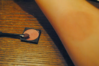
The next stage is adding a smidgen of bronzer, which is where you use a make up brush you ensure the bronzer comes out smooth and flat. Using this would make the section of skin, where the bruise is being placed, smooth and to avoid uneven tones of skin colour. This would also help for the eye-shadow to mix with it, which would make the whole effect of the bruise even more effective. you can get this bronzer from any type of shop, but all you need to take into account is that it have to suit the colour of the actor, which is very important as you do not want them to look orange. This photo show the first type of eye-shadow needed for the base colour of our bruise which we want to achieve. Using a eye-shadow brush, would allow you to delicately apply the eye-shadow, so that it can form an actual looking styled bruise. The shape should be a little uneven so that it is more realistic as usually bruises are not in a specific shape. Using a fairly light colour means if the shape goes wrong it would not be as noticeable as if I used a darker colour it would mean I would have to start over.
 These are the next types of colours I used. The first one was a shade up from the previous colour so it would make the colour before more visible to see. The next colour was added around the edge of the other two to show that the impact occurred more harshly around the edge, but also to bring out the bruise more. The final colour was to ensure that if I added too much of the darker brown I could blend it into my skin, so it would avoid me starting all over again, as that would be very time consuming.
 This stage is using even darker colours, dark blue and darker brown. This is to emphasis how the bruise is coming out as just like a real one would do. The blue eye-shadow is to symbolise the most painful part of the bruise as usually this is whereas the the darker brown is to help blend all the colours I have used so far, to make a gradient of colour. As you can see in the picture,these colours are the most dominant colours, which makes the bruise look very realistic, which is ideal for our opening two minutes of our film.
 This is the final result of making a bruise. This looks very much like a bruise as it has all the colours of one and suits the colour of the skin, meaning it doesn't look like it should not be there. However this shape may not be ideal for our film, as we should make it more like finger impressions, as if someone has grabbed someones arms. This may be ideal to be part of the protagonists make up regime as it could suggest domestic violence occurring in her life or something relatively similar.

This is all of the equipment used to make this bruise. The equipment I used was, bronzer, make up brush, moisturiser, blusher brush (optional), eye-shadow applicator ( one of two preferably) and eye-shadows. These colours should consist of three colours being the same colour but different shades of this colour, a blue and a pale skin colour.

Make up tutorials put into action- Cuts


I thought I should try out some of what I found on the tutorials, which would ensure that the process is an easy but very effective type of make up to use for our opening two minutes of our film.
First I added the moisturiser to my hands, which ensures my skin is moist and not dry. This would allow the make up to attach to the skin more and is less likely to come of if disturbed or touched. I used E45 cream to so it would not react with any of the resources I was using through this process as it would be very unprofessional if occurred.


This is the equipment I use to produce the cuts. Instead of using the wax make up which was present within the cut make up tutorial, I was advised to use this as it was less likely to react with people's skin where ever it was put and also if very easy to create indents and a cut effect as you have to actually cut the latex to produce the effect. I also used cotton buds to spread the substance onto my skin so I wouldn't get messy and could produce precise shapes.
This is when I was adding the latex substance to my and, with the use of the cotton bud. As you can see the substance come out white on the skin, which allows you too see where you are putting it. However after a few seconds it begins to dry and turns clear and shiny. This shininess would be reduce in the further stages of the process. I added the latex onto my skin in a sausage like shape, which would mean that it is easier to cut into the latex as it would have lots of areas to attach itself on to the skin. 
This latex would have to be repeatedly added so that it would build up layers, similarly to our skins, the thicker and more layers you do the most effective the cut appeared like. This also allows lots of fake blood to fill the indent, which would add to the effect of blood flowing out of the deep gash. As you can see I have put many layers on top of each other. In this picture on the left I have added foundation and bronzer to make the cut seem like it is my own skin, rather than making it look very fake and unreal. Adding the use of bronzer, with a brush, reduces the shininess of the latex, ensuring the effect of human skin. 
As you can see, this stage is fairly difficult as you have to be careful using the scissors. In this stage you to cut the latex with the scissors, which due to the use of this type of latex, it is easy to cut through, avoiding cutting your actual skin. This is one of the longest parts of the process in forming a cut as you have to be precise and accurate as this determines the shape of your cut. Using this cutting effect makes the latex peel, which creates the effect of the skin actually being cut. Due to the moisturiser used at the beginning, the latex does not effect the skin in any way. Be careful during the cutting stage! 
During this stage if some added make up ( bronzer/ foundation) is removed, re-add some to sure there is no shininess or discolouration present. Next add red paint to the indentation of the cut, this may not realistic yet but adding different colours from darker red to brown would add the effect of scubs forming or being recently cut, which is ideal for the use of it being used in the opening scenes. Adding the surrounding part of the indentation with a darker colour shows the dried blood effect and emphasises the deepness of the cut.
 This is the finally result as you can see on the right. This is very effective to use as it appears to look very realistic, and emphasises the pain and depth of the cut. The use of the various colours used on the cut, increases the realistic of the cut and if we do use this effect, close ups would be no problem as we can add further detail if needed. Including a slight shine to the cut suggests that the cut is becoming increasingly infected. This could be ideal for the use of being in our film as the antagonist can have these on various parts of their skins, especially the hands  and even the face, depending on the use of costume. As you can see this is all the equipment I used to produce this cut. I used: a paintbrush, scissors, moisturiser, foundation, bronzer, sponges, skin latex, warm water, make up brush, cotton buds and paint, which consist of two shade of red (scarlet and bright red) and brown. Overall this is a very good idea to use to for our make up for the antagonist, plus it follows the conventions of a horror as involves blood and gore.

Make up tutorials- cuts and bruises (injury effects)

This research is to investigate what kind of make up we could use to add the effect of injuries and brutality, which occurs during the opening scene. This video I discovered from Youtube, which is very reliable to use as this was broadcast on a BBC show, which is aimed for children; this means it is easy to do even for children.

How to make cuts? - Online tutorial.
 As you can see throughout this tutorial the equipment needed to produce an effective cut is fairly easy to require, as to begin with moisturiser and make up wax is needed. The equipment also includes make up foundation ( preferably the same colour as the actors to ensure the cut looks as gruesome as a real cut), paintbrushes, cotton buds, spatula, red- brown paint and fake blood. This is all equipment which we can purchase from local shops and off the internet, with little expense.
This process is very easy to do as this tutorial was aimed at young individuals, which means the process would be easy and quick to do, with high quality results at the end. This would mean that we can focus more time on filming as this make up process does not take that long to achieve. As it is an accurate but quick process it would mean we can do quite a few of these on the actor, to show the brutality and fatally they faced, during trying to defend themselves. However as this is research these elements may not be used in our final production.
I believe this is very effective as these cuts can be added either on the antagonist or on the protagonist. Adding this make up on the antagonist, would create an enigma as the audience would not know how and where the antagonist gained these injuries. This could suggest that this is not the first time the antagonist has striked, meaning this is not his first victim...
Using this make up effect on the protagonist, could add many engima's for the audience as well. Firstly we 
could use them to suggest that they have been in a fight previously but who with. They could also be used to suggest domestic violence, or something which has occurred between someone,which the audience wants to know desperately.

How to make bruises? - Online tutorial
This piece of research is to see the effects of bruises would be ideal for our opening scene. 
Throughout this tutorial you can see that the process is relatively easy to do due to the use of make up brushes, and the technique of using them. 
This could be effective to use on the antagonist to make they seem as if they have been in previous fights with their previous targets and victims. It could also be use for the protagonist, for the same reasons for using the cuts on them. This could symbolise violence occurring in the characters life, which could occurred by their partner or other sources.